Table of Contents and Double-Spread- HUGGE CHANGES!!
I know this might sound crazy but I redid my whole magazine layout, it's not that I didn't like my old format. I just felt it wasn't true to the photography aspect that I'm supposed to be portraying it felt like a seventeen magazine because it was lacking that artistic element it needed.
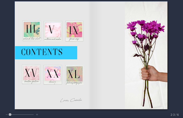


The table of contents needed to be reformated because my groups didn't agree with the other format and font that was used. Therefore we revamped and shortened a number of pages displayed. I still wanted to keep my original photograph but I changed the background to white in order to add minimalist feel that wouldn't distract from the pink flowers and colorful polaroids. I wanted to add the polaroids because it brought attention to the numbers through a vintage and artistic look to give the more personal handcrafted feel. The marble all contrast really well with each other since they have the same color palettes sticking with shades of various pinks to bring everything together.

The double page spread I wanted to keep the minimalistic look that I had on the contents page of my magazine. I wanted everything to be structured yet have a handcrafted look with the fonts I used which look handwritten, the polaroids would replace the pictures of the flower and iPad displaying Shannon's Instagram in a unique and artistic manner. The content itself stayed the same the colors were just toned down a lot more to make the photographs as the focal point and interview additives to the photographs I took. Overall I'm very pleased with the aesthetics I achieved this time around, it captures the look and feels of an artistic photography magazine.
Comments
Post a Comment